
Designing an inviting and stylish living space is an art. The key? Choosing the perfect color palette! Dive into tried-and-true living room color schemes that designers absolutely love.
Choosing the Right Color Palette for Your Living Room
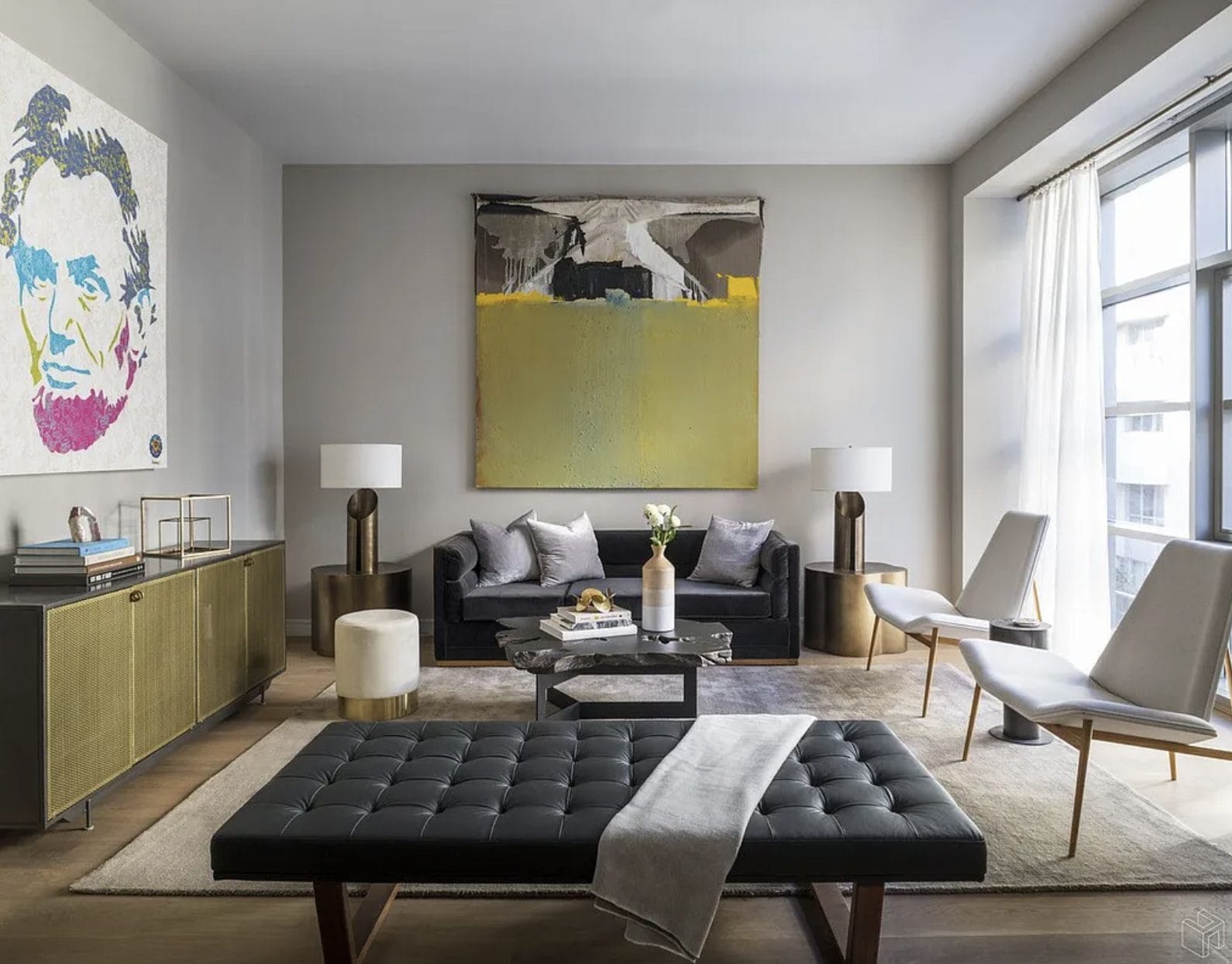
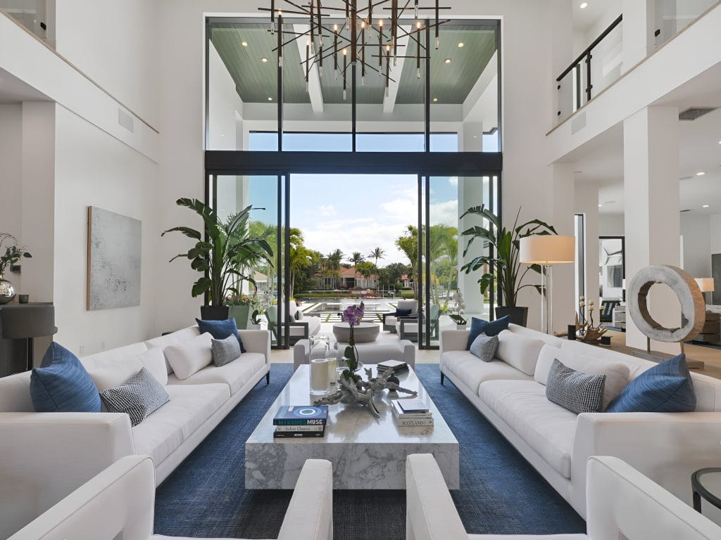
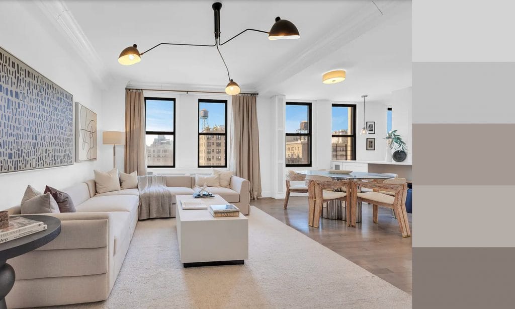
 Modern apartment design by Decorilla designer, Joyce T.
Think of your home’s palette as a melody that connects every part of your interior into a harmonious whole. It repeats throughout for a rhythmic and uniform style. There’s no better place to set the tone than at the center of your interior, whether monochrome, color-blocking, or something in between. Follow these tips below to ensure your living room wall and decor color scheme is cohesive.
Pro Tip: Different design styles work better in certain colors than others. So, match your favorite living room color schemes to your home’s style. Not sure what that is? Take our Free Interior Design Style Quiz to discover your true decorating style!
How to Create a Beautiful Color Palette: Quick Tips
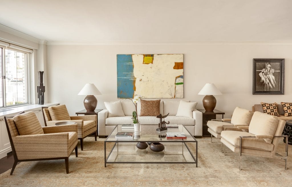
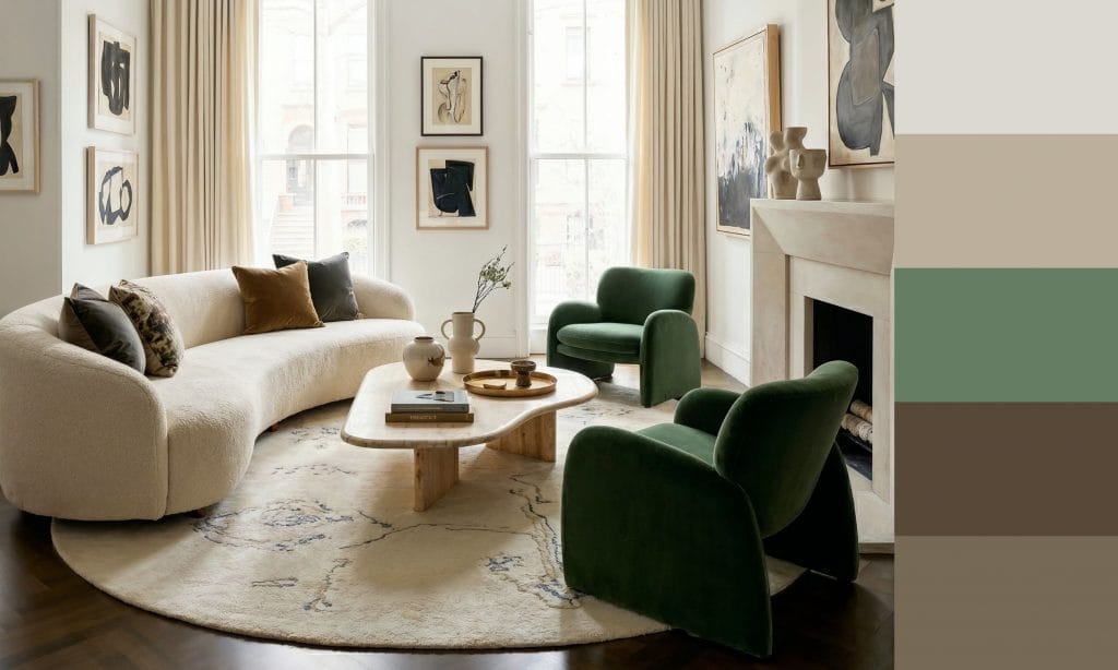
 A small apartment living room by Decorilla designer, Leonora M.
- Let existing elements inspire you. Your biggest and most prominent pieces can guide your designer interior update, e.g. a patterned rug can indicate which colors will work best. One of its neutral hues could work for walls, a darker shade for complementary furniture, and brighter tones for accent decor.
- Think about the mood and the atmosphere you want. Colors evoke emotions, so pick ones that align with the feeling you aim for. Cooler tones like green and blue are calm and serene, fiery yellows and red are energetic and vibrant, while layered neutrals and darker shades can feel cozy and warm.
- Stick to three to five colors for living room color schemes. This will make creating a harmonious design and coordinating colors easier.
 Classy coastal interior by Decorilla designer, Judi M.
- Balance bold and neutral. Too much of one or the other can be overwhelming. So, use neutral tones as a base and add pops of color or contrast for interest.
- Consider your light and test your colors. Lighting significantly impacts our color perception. Natural light, for example, reveals the truest tones. Test your picks, like fabric and paint samples, during different times of the day to ensure they look good during the day and night. You’ll also see how they look and work as a combination.
- Use the 60-30-10 rule for your living room color scheme. Pick one dominant color covering about 60% of the room – think walls and floors or a combination of furniture and surfaces. One or two secondary colors should make up 30%, and the remaining 10% should go to an accent hue that contrasts or uplifts the rest of the palette.
Best Living Room Color Scheme Ideas
 Contemporary living room by Decorilla designer, Leonora M.
Explore our favorite living room wall color schemes, where the right hues give off the designer look, plus a sense of authenticity. From earth-tone color palettes to monochromatic and jewel magic, here are a variety of tones to suit each individual!
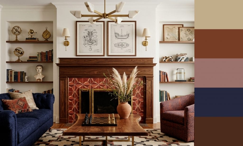
1. Warm-Cool Calm: Chic Brown, Blue & White
 Elegant living room by Decorilla designer, Catherine W.
Warm and cool colors work so well together to create a balanced design. Take this living room color palette as an example. Its chestnut leather, wood, and cobalt blue accent chair set against a crisp white wall make magic. The proportions are just right, too. Neutrals make up most of the space, but it’s the secondary color (browns) and accent blue that define the design.
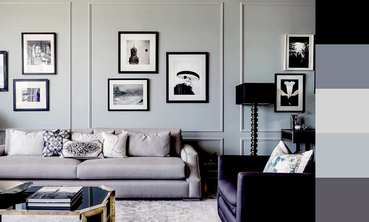
2. Curated Contrast: Veined Marble-Inspired Interior
 Black and white living room color schemes with grey, by Decrorilla
As far as a sophisticated color combo for the living room goes, a classic black & white epitomizes a timeless feel. Even in a contemporary scheme like this one, owing a lot to its inspiring focal point. A central feature, like this marble fireplace slab, can dictate your living room color palette. The off-white couches and soft gray and cream accents contrast beautifully with the bold dark gradients, proving that even a limited color scheme can deliver a powerful impact. The jewel touch provides just enough visual warmth to offset the stark palette.
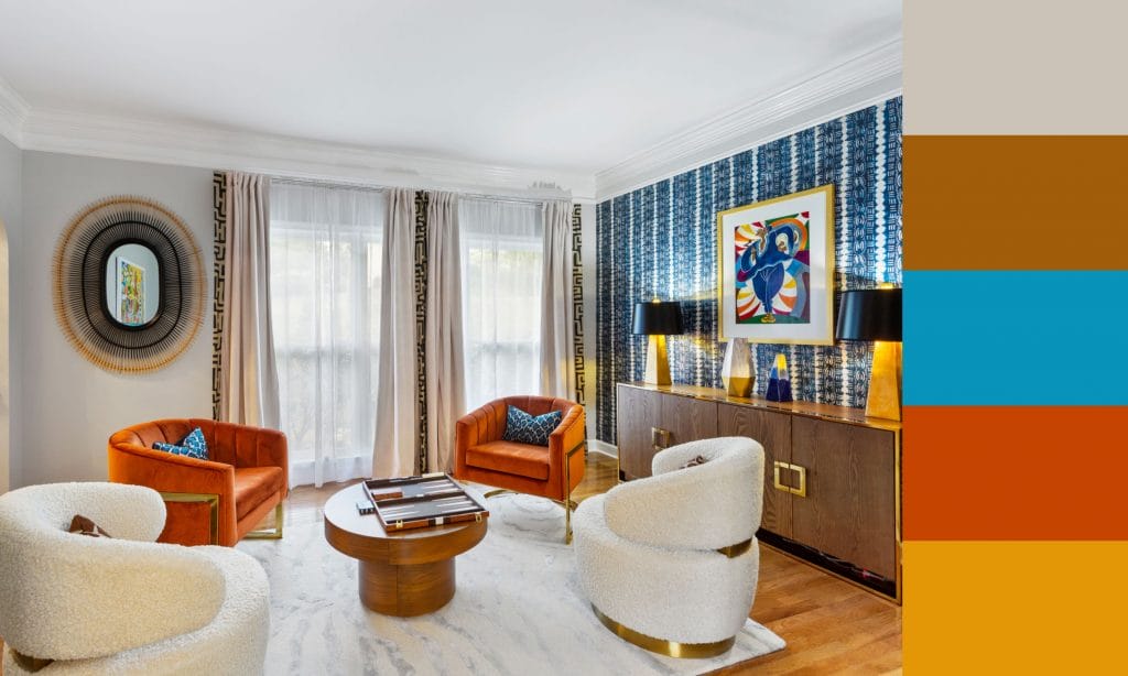
3. Jewel Allure: Gem Tones and Gold
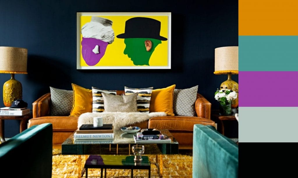 Jewel-toned living room color schemes with neutrals, by Decorilla
For a luxurious take on living room color design ideas, mix deep jewel tones with white & black, or warm neutrals. Here, an amber sofa becomes the centerpiece set against the gem-colored armchairs and black walls. It ties in with the vibrant wall paint, creating a rich, jewel-toned harmony. A chain of strong contrasts creates a visual rhythm and pulls the gaze through the room.
4. Chic Elegance: Contrasting Black and Pink
 Pink and charcoal grey color scheme for a living room. by Decorilla
Living room wall color schemes can be as subdued or extravagant as you want. This lounge, for instance, makes the best use of contrasting gentle against bold. On the one hand, white background with matte black accents sets a classy base, and on the other, smooth pops of pink warm the design. This pairing sets a dynamic interior that feels lively despite its serene organic style. And if you feel extra daring, try color drenching with pink, and then soften the layout with neutral grays and creams.
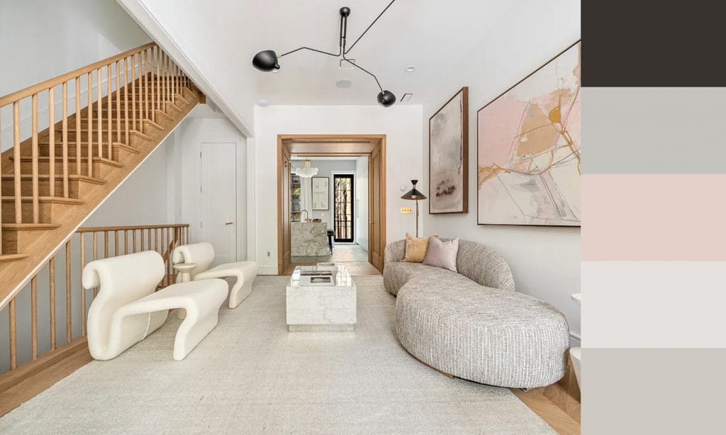
5. Timeless Tranquility: Layered Peaceful Neutrals
 Living room color schemes with an earthy color palette, by Decorilla
A serene blend of creamy beiges and soft whites is a great choice for your warm neutral living room makeover. The natural light enhances the warm hues, while the darker wood tones provide a grounding. Making the most of darker accents or details is crucial in all neutral living room color schemes. It’s important to provide distinction, and fortunately, it’s easy to do in a light interior. Also, be sure to add a pop of interest, like an invigorating green houseplant.
6. Modern Monochrome: Chic Gray Gradient
 Gray living room color scheme by Decorilla designer, Joseph G.
This monochromatic living room‘s color scheme with gray showcases a harmonious gradient of tones. You can achieve that by differentiating textures and upholstery, or mixing graphic patterns. Different shapes, tonal contrasts in fabric, and the use of vertical space for a gallery wall keep the space intriguing.
7. Autumnal Aura: Rich Warm Tones and Off-White
 Modern living room color palette ideas by Decorilla
Want your space to feel like a cozy hug? Rich reds mixed with earthy tones might be the best living room colors for you. Remember to pick a balancing base, like a neutral off-white or sandy brown. Your surfaces can be color-drenched, but ensure a grounding element for eyes to rest and to break the possible monotony of one tone.
8. Painter’s Harmony in Hues: Black, White & Gold
 Contemporary black and white interior design by Decorilla designer, Leanna S.
This living room’s high-contrast color palette draws inspiration from contemporary artwork, featuring a blend of stark black and white. With a clever use of artwork, streamlined seating, and a line rug, the interior mimics the bold strokes of abstract linework. Gold is the key to softening the space. Its warm hue offsets the cool tones while also adding a touch of luxury.
9. Classic Charm: Traditional Color Palette with a Twist
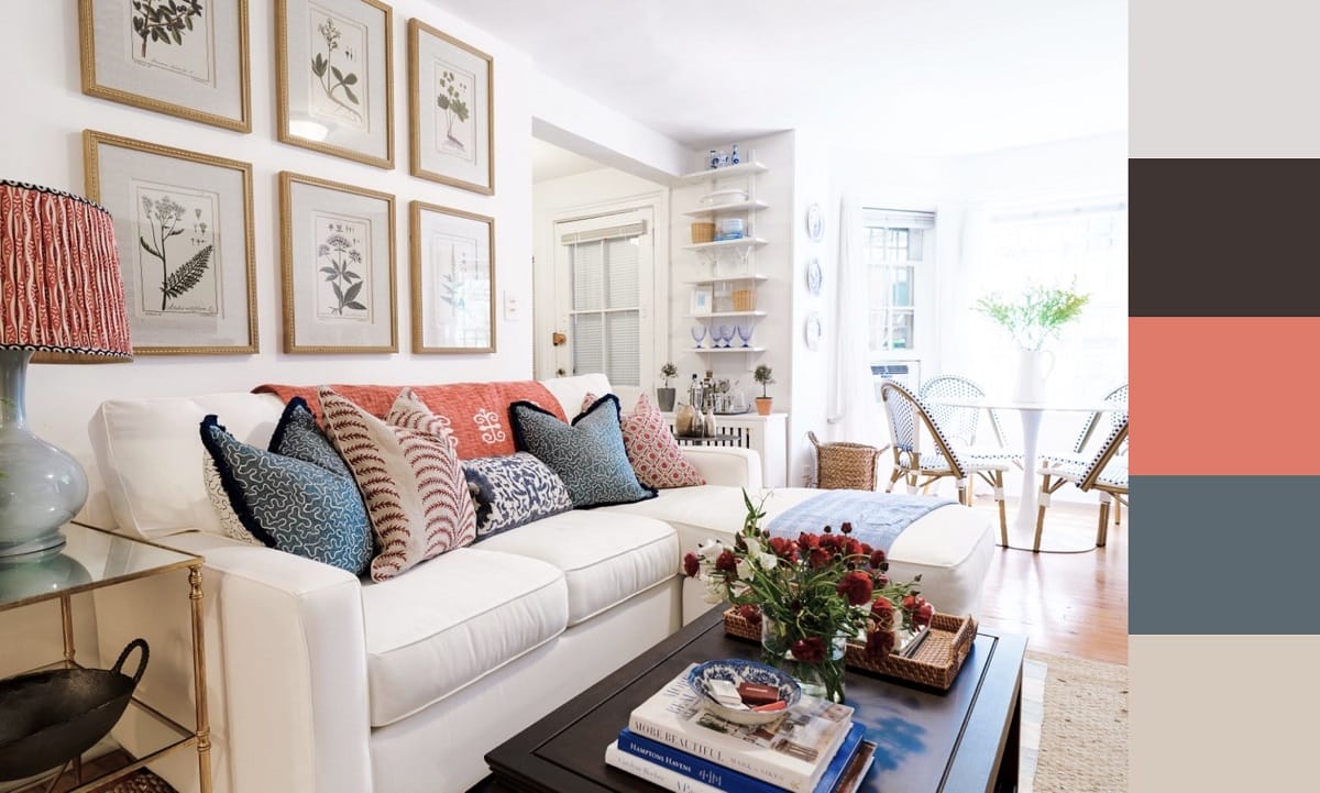 Transitional open-concept living room by Decorilla designer, Rene P.
With its soft white backdrop and classic furniture pieces, this traditional color palette then adds a playful touch with vibrant blue and coral accents. The mix of patterns among the throw pillows and the curated botanical prints on the wall infuses the room with a timeless yet personalized aesthetic.
10. Nature’s Equilibrium: Brown, Green and Terracotta
 Nature-driven color scheme for a living room, by Decorilla
Step into your living room and relax instantly! Picture rich, deep greens wrapping you in the embrace of a forest canopy. Terracotta accents bring the warmth of autumn leaves, while cozy beige in pillows lightens up the scheme. You can also mix wood tones to bring the serenity of nature indoors, where every color tells of the quiet beauty found in the heart of the forest.
11. Seaside Serenity: Soft Neutrals with Blues
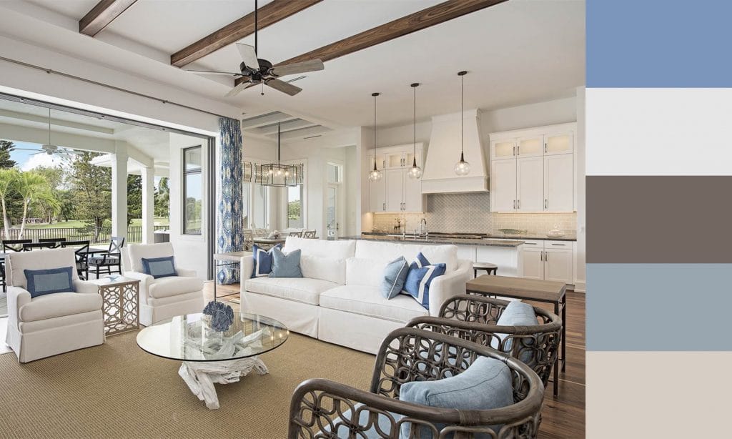 Coastal living room color scheme and interior layout by Decorilla designer, Wanda P.
A soothing array of sand-like neutrals and oceanic blues mirrors the tranquil seaside surroundings. It works so well because of the combo of natural textures and light, airy tones, creating a space that feels like an extension of the shoreline outside. You can create a just as serene coastal design – just focus on a mainly light palette with one vibrant and one dark accent. Remember to layer interest through textures and form.
12. Formal Meets Fun: Vibrant Modern Living Room Palette
 Jewel-toned living room color schemes with neutrals, by Decorilla designer, Sierra G.
Modern minimalist design with a twist is becoming increasingly popular. By using muted beige and off-whites as a canvas for bold pops of blue, butter yellow, and coral, the interior feels both grounded and lively. For a refined, vibrant living room, pick one or two neutrals as the dominant and secondary colors, and keep your bright accent tones to three or fewer.
13. Minimal Urban Oasis: Light Warm Tones & Black Accents
 Modern organic living room by Decorilla designer, Leanna S.
Calming spaces with a positive energy, like Japandi design, are on the rise. Take the color used in this minimalist Japanese-inspired interior, for instance. Its layering of light, warm neutrals is successful because each piece can be appreciated individually. Each stands out thanks to either form, texture, or size. Black decor punctuates the design, giving it just that little bit of contrast to keep things interesting.
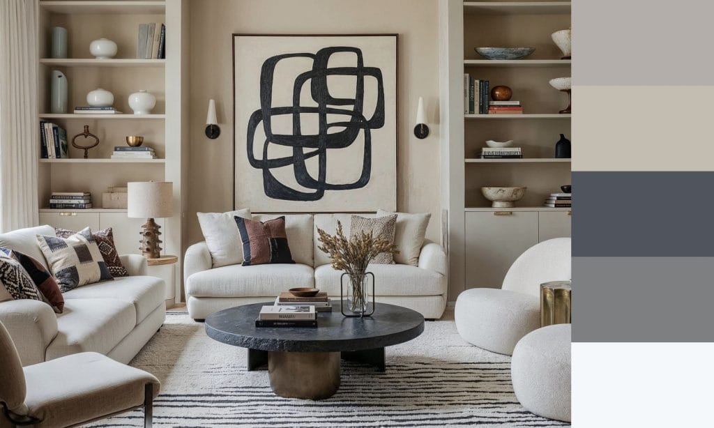
14. Outside In: Wood Tones & Warm Neutrals
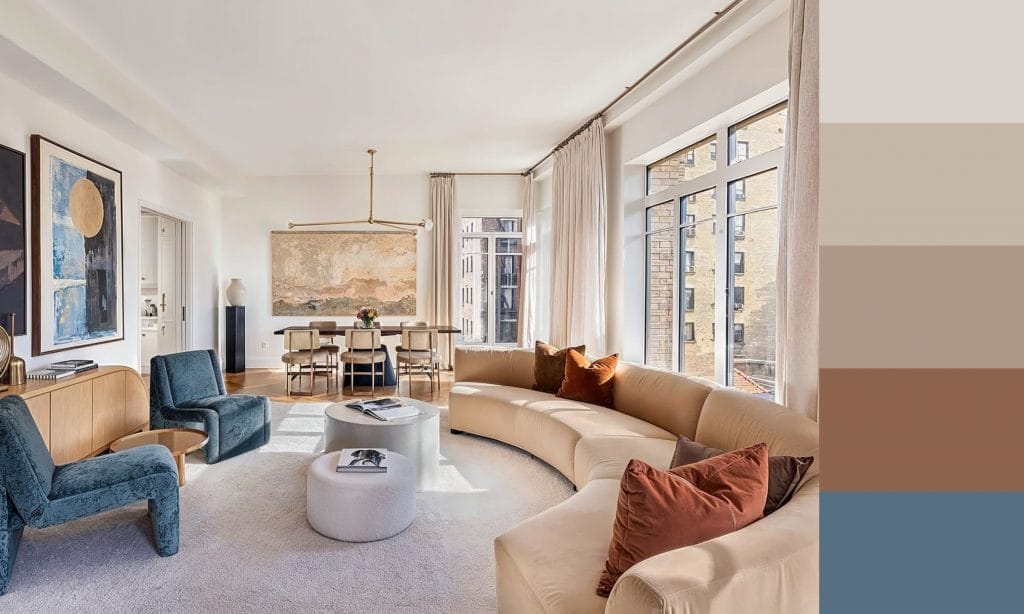 Warm neutral living room by Decorilla designer, Leanna S.
This living room color palette speaks to the serene and sophisticated, with a symphony of warm neutral tones harmonizing with the tactile appeal of organic materials. Although this interior is far from minimal, it’s just as calming thanks to its coordinated color scheme.
15. Cozy Corner: Soft Neutral and Caramel
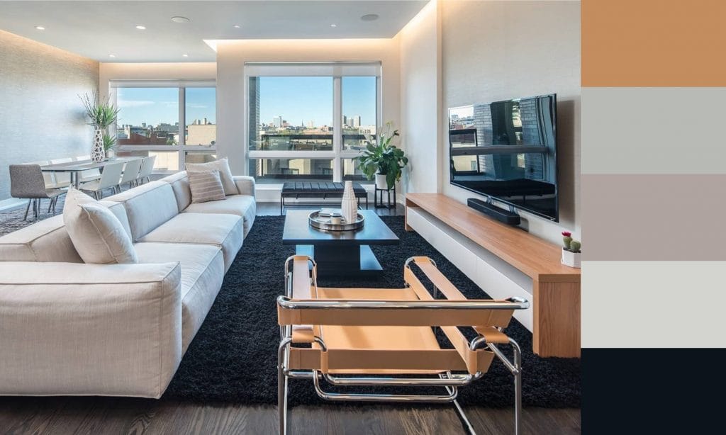 Natural living room color palette by Decorilla designer, Matthew J.
This living room’s cool color palette features a blend of greys, taupes, and black, all spiced up by caramel leather and wood accents. The use of natural materials throughout the space enhances the connection to the outdoors, even though the layout style is contemporary minimalist and almost stark in its sleekness. The result feels grounded and calm.
Ready for more than a perfect living room color palette?
Transform your living room into a haven of beauty and comfort now! Simply schedule a Free Interior Design Consultation to get started with our team of leading experts today!